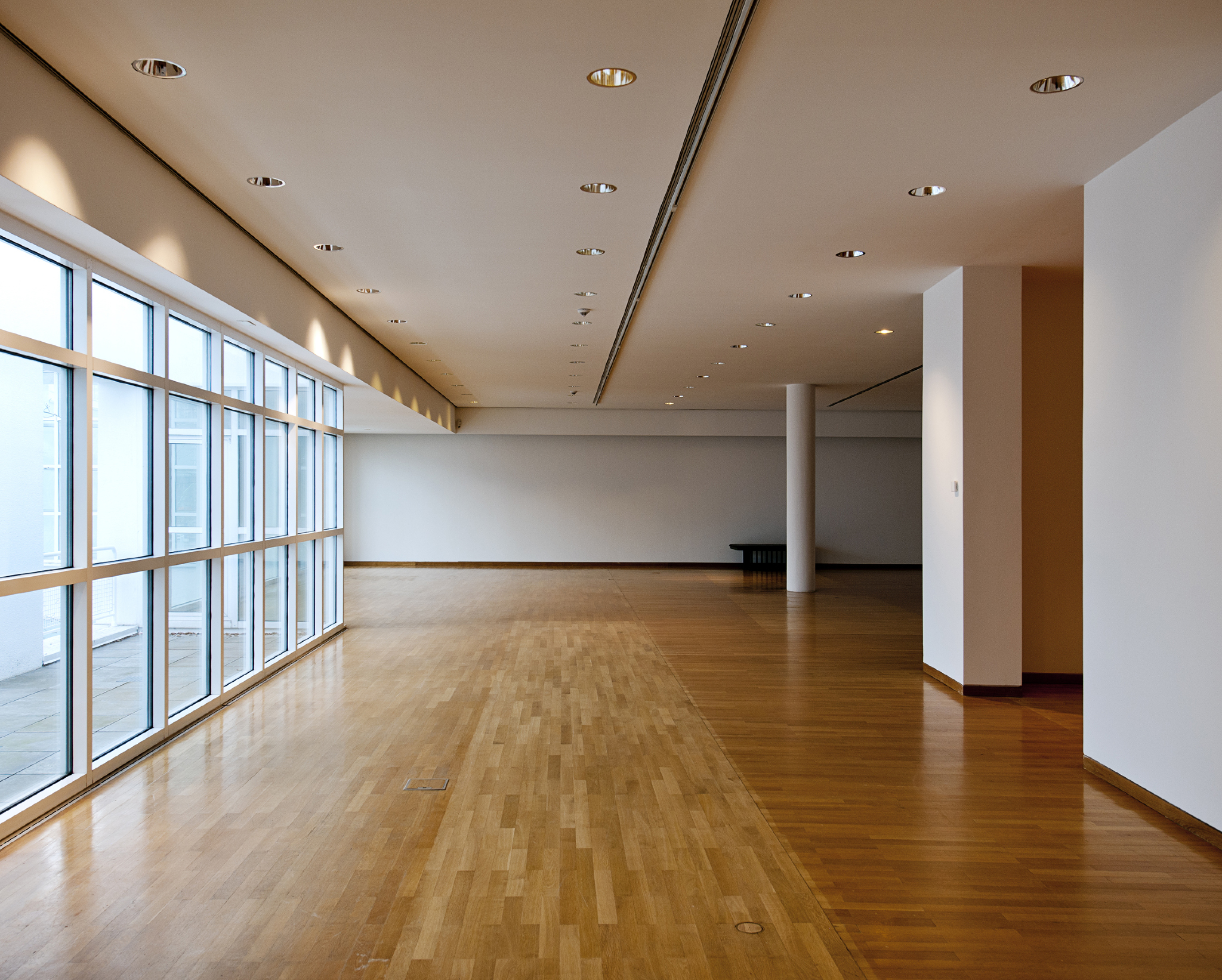
The Empty House
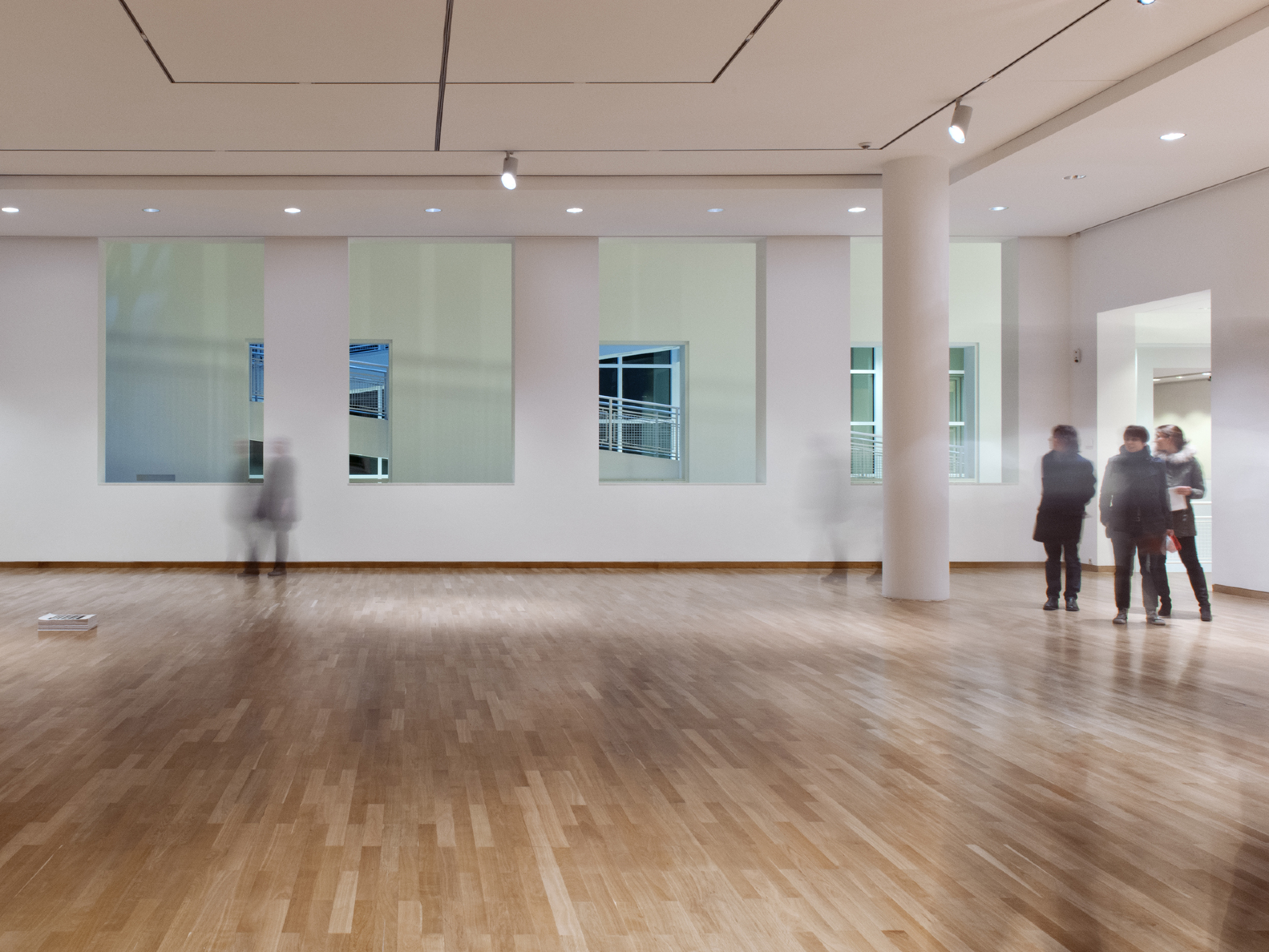
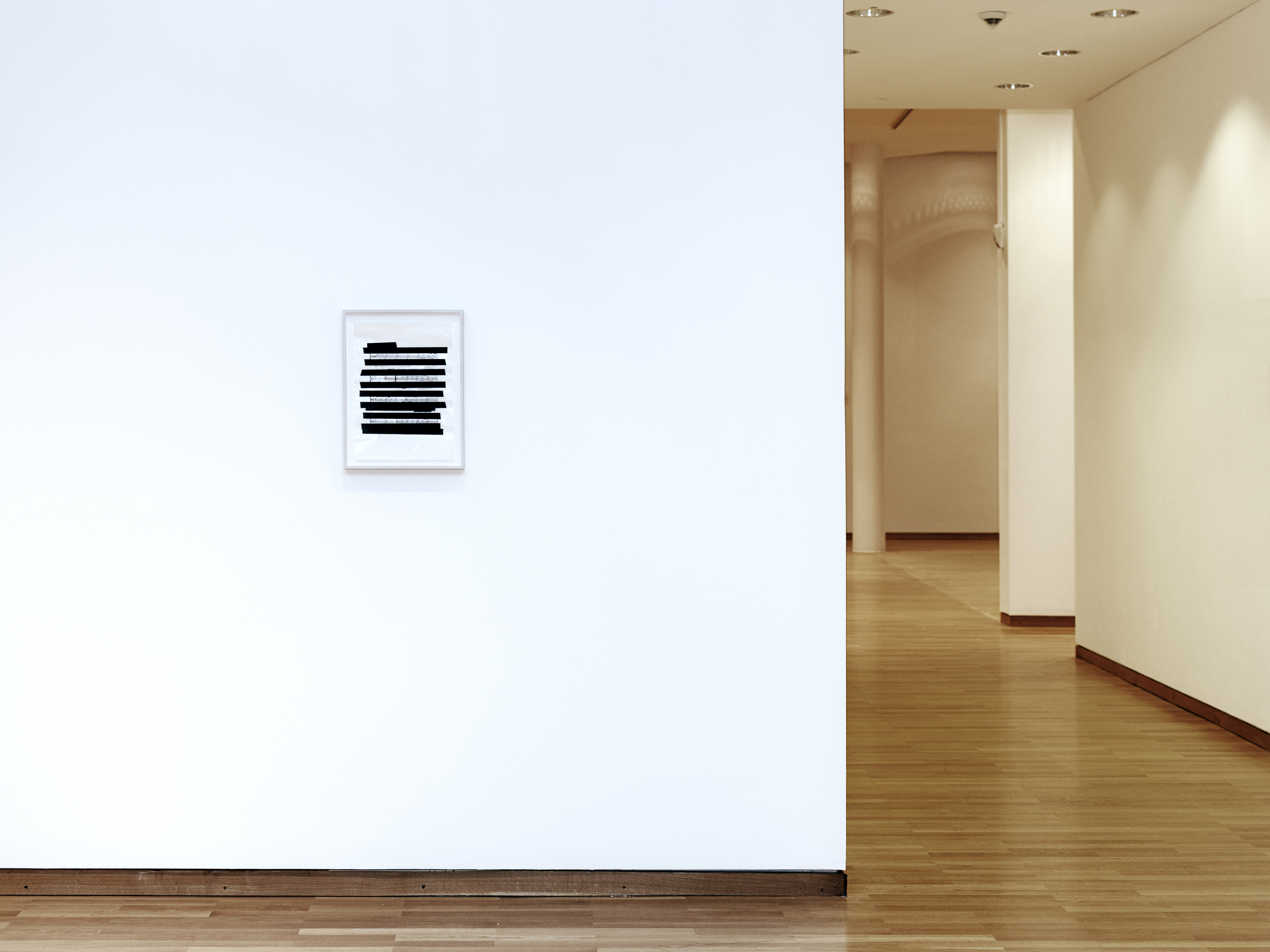
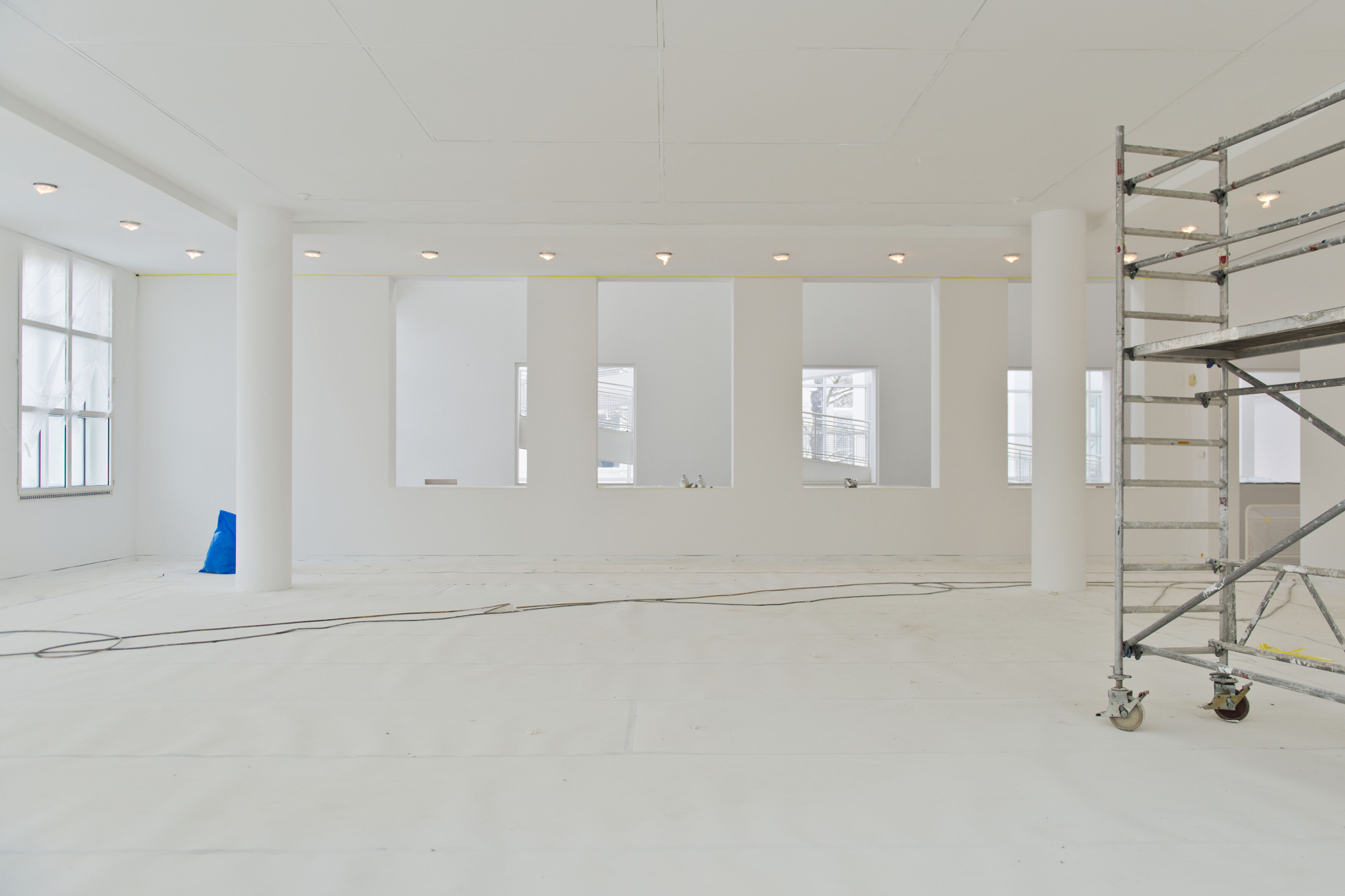
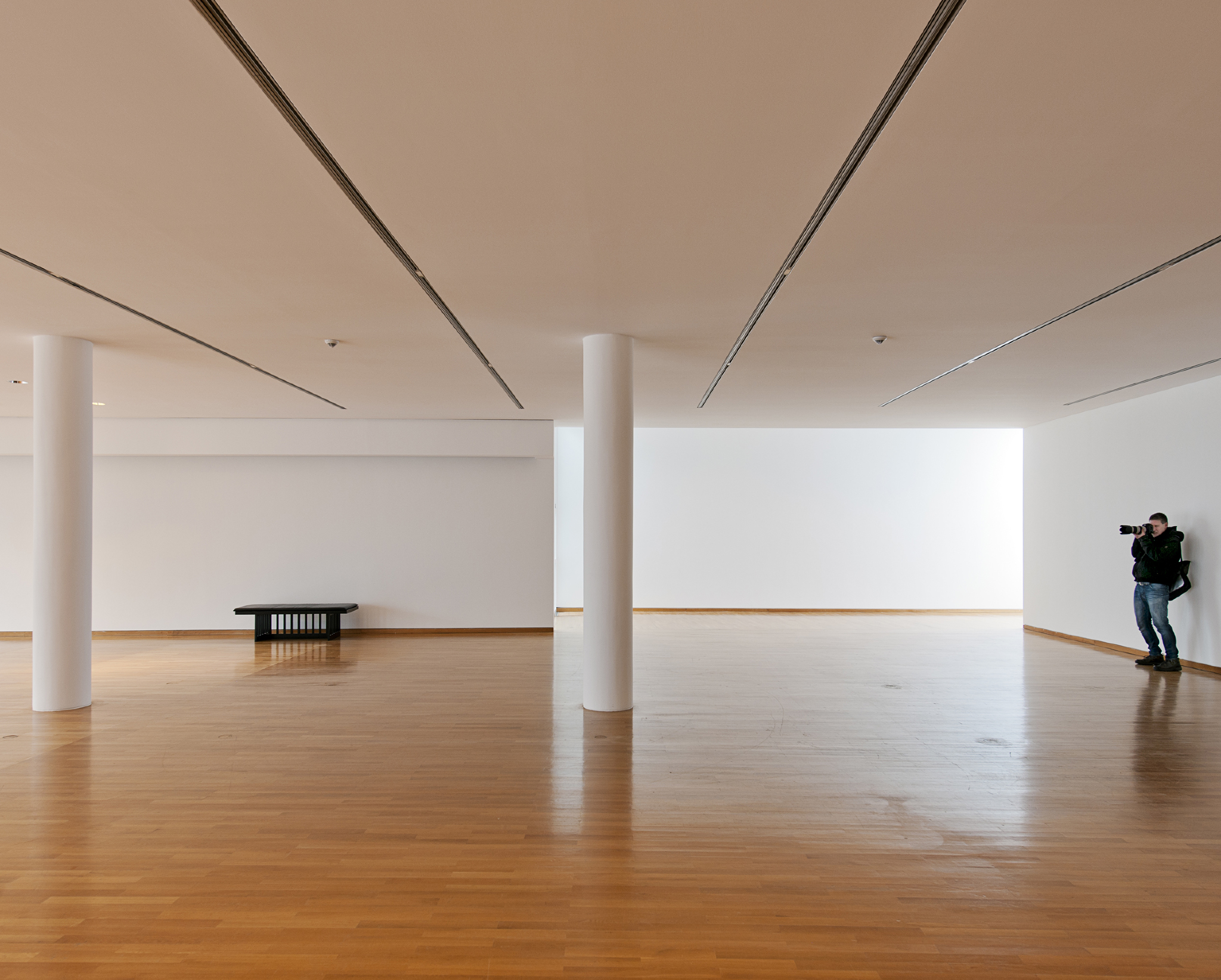
On 7 March, 2013, after a three-month phase of renovations, the Museum Angewandte Kunst Frankfurt/Main opens to visitors again – but only for a brief interlude. Twenty-seven years after its construction, the Richard Meier building has been returned to its original state. All alterations and installations not called for by the original design have been removed, visual axes recreated, the building’s transparency restored, the white of the interiors renewed. Before the future exhibitions are installed, the empty building presents itself for three and a half days (and an entire night!) as “The Empty House” – providing a unique opportunity to experience it in unadulterated form: pure architecture. The emptiness shown here is full, full of histories, full of references and details. It’s almost like silence: as soon as you become attentive to it, it comes alive with sounds.
"The place was pitch dark, but it was evident to me that it was an empty house. Our feet creaked and crackled over the bare planking, and my outstretched hand touched a wall from which the paper was hanging in ribbons. Holmes’s cold, thin fingers closed round my wrist and led me forward down a long hall, until I dimly saw the murky fanlight over the door. Here Holmes turned suddenly to the right and we found ourselves in a large, square, empty room, heavily shadowed in the corners, but faintly lit in the centre from the lights of the street beyond. There was no lamp near, and the window was thick with dust, so that we could only just discern each other’s figures within. My companion put his hand upon my shoulder and his lips close to my ear."
Sir Arthur Conan Doyle, The Adventure of the Empty House, 1903
Sir Arthur Conan Doyle, The Adventure of the Empty House, 1903
Neufert
If you open a copy of the Neufert – the more than 600-pages-strong architect’s bible of construction norms, rules and techniques that lists countless mundane details ranging from the size of parking spaces and the layout of warehouses to the official shape of Olympic swimming pools – and look up the word ‘museum’, you will find it only devotes three pages to the subject. Most of their content deals with issues of natural or artificial light and the hanging height of artworks in relation to the spectator’s gaze. But Ernst Neufert and his team also provide a few examples: Frank Lloyd Wright’s Guggenheim, Renzo Piano and Richard Rogers’s Centre Pompidou, Hans Hollein’s Museum Abteiberg in Mönchengladbach, and Richard Meier’s Museum of Applied Arts in Frankfurt. Surely, this is the greatest recognition an architect can hope to receive in his career: being identified as the designer of a building that is universally referenced, an archetype to be studied by all aspiring architects.
Competition
When looking at the results of architectural competitions with the benefit of hindsight, you sometimes realise that the juries’ appraisals were misled. The history of architecture is littered with buildings that will never be constructed because they failed to convince on paper. But if you were to take a closer look at the projects assessed on 11 and 12 April 1980 by the jurors of the competition for the Museum of Applied Arts in Frankfurt, you would have to acknowledge that Richard Meier proposed two principles that none of his colleagues’ designs was able to match. Firstly, by playing with proportions, geometric rules and subtle regulating lines, he achieves a perfect integration of the historic Villa Metzler, an 1803 townhouse that was the starting point for the museum. He reiterates the volume of the Villa three times to create a square and a cloister filled with trees. Another example showing that he is particularly good at working with and around existing buildings is his project for the extension of the library at Yale University, a superb building by Paul Rudolph. Meier is indeed at his best when the constraints are such that he is forced to make do and adapt his design principles. Secondly, Meier’s plan for the Museum of Applied Arts concentrates and condenses the extension around the existing villa, freeing up space for a park that runs along the museum. While his competitors were keen to strike a balance between the old and the new, and to preserve the trees and the natural environment, none of them merged these two aspects as skilfully as Meier. There is no doubt that he won this competition for objective rather than subjective reasons – reasons that are still obvious to visitors today. Similarly, the jury that gathered in 1971 to discuss the architectural proposals for the Centre Pompidou did not merely base its decision on the revolutionary aesthetics of Piano and Rogers’s design, but also on its urban integration. Theirs was indeed the only project to articulate, in the heart of vieux Paris, a vast esplanade, a new urban piazza in an otherwise densely built area. Both designs – the Museum of Applied Arts and the Centre Pompidou – share similar concerns in that they transcend questions of taste; in fact, they are neighbours in the Neufert, which goes to prove that architecture can at times be an exact science.

Meier already had a track record in the USA when he designed the Museum of Applied Arts in the late 1970s, but he had never built in Europe. In the mid-1960s he had started designing modern residential houses in New York State that were strongly inspired by Le Corbusier’s villas from the 1920s: white rectangles on stilts with double-height spaces. Many of Meier’s projects from that time feature the ramp from Villa Savoye in Poissy (1928–31), but I believe he spent most of his time admiring the less spectacular but incomparably more complex Villa Stein in Garches (1926–28). His curbs and balustrades also remind me of Hans Scharoun’s sublime Schminke House (1932–33) in Löbau. But beyond the details and the modernist aesthetics, Meier is fascinated by the spatial variations, the ‘clever, accurate and magnificent play with volumes assembled in light’, as Le Corbusier put it in 1923. But while Meier’s architecture bears the mark of Corbusianism, it plays freely with its codes. Le Corbusier wrote manifestos to support his architecture and defend it against critics and a largely hostile public opinion, while by the time Meier started to build the modernist style had become accepted, not to say fashionable. Meier steers clear of manifestos (he is not a prolific writer, for that matter), and instead favours a playful approach (in keeping with the spirit of the 1970s and the emergence of postmodernism). His design for the Museum of Applied Arts, for instance, uses an angle of 3.5 degrees derived from the position of the Villa Metzler in relation to the bank of the River Main. This angle then defines not only the association of volumes but also the layout of the sandstone floor tiles. The genius of this building is that it combines – without any dogmatism, but with a hint of mannerism – style, image and quality of spaces with a playful and sophisticated geometry.
Anachronism and post-modernity
But Meier also loves the Viennese Secession, Thonet chairs and belle-époque fashion. In the perspective drawings of his projects from the 1980s he uses people drawn by Otto Wagner in 1913, and the first chairs (white, like the rest of his architecture) in the museum restaurant were purchased from Thonet. Meier plays with anachronisms, but we should never forget that whereas he merely borrows subtle details or images from great architects from the early twentieth century, many of his colleagues are busy scavenging the history books to produce an architecture of collage and colourful pastiche. In a sense, he too is a postmodern architect, but he chooses his references carefully and, more importantly, loves and respects them profoundly. While Robert Venturi urged striving architects to learn everything about Las Vegas, encouraging them to take a closer look at shopping malls and advocating a return to (garish) ornament, Meier simply wants us to learn from modern architecture its way with whiteness, minimalism and spaces.
A famous book by Le Corbusier is entitled When Cathedrals Were White, and it is obvious that Meier always bears this in mind when designing a building. In recent years, however, restorers have evidenced the polychromy of early modernist architecture by stripping the coats of white paint and laying bare the original colour pigments. The fact that, in most instances, the only available documents from that time are black-and-white photographs had allowed Le Corbusier’s dogma to become law. The current revision owes much to the work of architect Winfried Brenne, who supervised the restoration of Bruno Taut’s buildings in Berlin, and visiting the Dessau Bauhaus today comes with its string of colourful surprises. But while Meier refutes colour, it is interesting to note that, when it comes to artificial lighting, he prefers a distinctively warm colour temperature. Whiteness, in Meier’s architecture, is not clinical but domestic, creating an atmosphere to which the oak flooring adds yet more warmth. But his white also aims to create a totally neutral environment for the art on display: the colour should not come from the walls, but from the exhibited artwork. The architectural setting veils itself in neutrality, in the tradition of the white cube cherished by galleries and art centres.

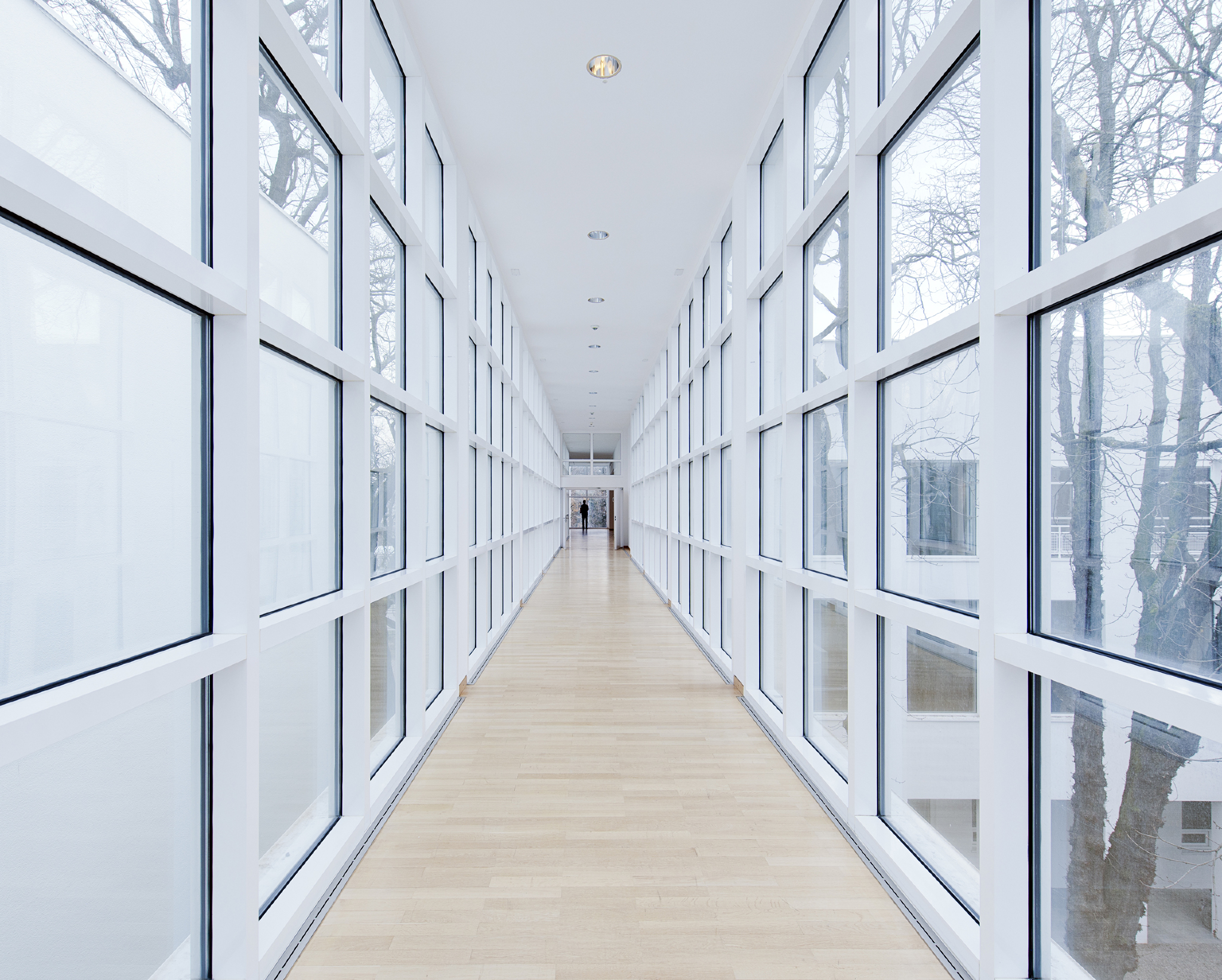
Meier’s architecture is a slow and constantly evolving process, and whether visiting the Arp Museum in Remagen, the Museum Frieder Burda in Baden-Baden or the Stadthaus Ulm (to stay with cultural buildings within a radius of 300 kilometres from Frankfurt), you will notice a series of recurring features, including the white guardrails reminiscent of naval architecture and cruise liners, the beautiful oak flooring, and the large bay windows. Meier articulated a precise formal vocabulary in the early stages of his career (as witness the Museum of Applied Arts). When designing a project, he does not ponder over how to design a handrail or reinvent a detail on a doorknob, but over how to perfectly integrate the building in its surroundings and create generous and unexpected spatial relationships. In this sense his work must be likened to that of Tadao Ando, who always uses the same type of concrete and the same grid to create ever-changing buildings. Admittedly, Meier uses a reduced architectural vocabulary, repeats himself and toys with historic references, but this is also the best way to avoid the countless little questions that divert one’s attention from the key challenges of architecture: its volumes, its relationship to the site, its functionality.

Why visit this empty museum today? Firstly, to assess its spatial qualities, the ceiling height, the perspectives and the architectural promenade5 designed by the architect. At each turn of a corner the view on the building, the park and the skyline changes. Secondly, to understand that no architecture will ever be redeemed by decoration or interior design. Indeed, a building must be judged solely on the quality of its spaces and detailing, not on the colour of its carpets. Beautiful architecture does not need special clothing. Thirdly and finally, in an era marked by spectacular architecture and increasingly sculptural forms, to sense the domestic essence of the spaces designed by Meier and enjoy a moment of calm and respite in these hectic times. You see, you should have no trouble imagining yourself living here, putting the sofa there, sleeping in this or that part of the building… What Meier built in Frankfurt is a large modern house that mirrors the historic Villa Metzler – a place of living for humans and artworks alike. This is why our project is entitled The Empty House. Meier creates democratic spaces: rather than trying to impress visitors with monumental effects, he welcomes them, guides them, comforts them. This kind of attitude has largely disappeared since the construction of the Guggenheim in Bilbao. Yet this very characteristic – its fundamentally anti-spectacular stance – makes Meier’s project an essential statement that reflects the spirit of a time gone by.
Emptiness
The emptiness we are shown here is full – full of histories, full of references and details, full of air and space. It’s almost like silence: as soon as you become attentive to it, it comes alive with sounds.
![]()
![]()
The Empty House
Museum Angewandte Kunst, Frankfurt/Main (Germany)
March 7 — 10, 2013
Curated by Thibaut de Ruyter
Artist: Olaf Nicolai